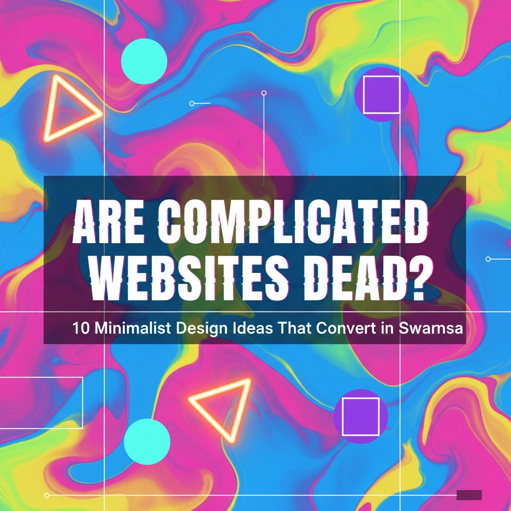
Remember when websites looked like digital billboards with flashing banners, spinning logos, and enough colours to make a rainbow jealous? Well, those days are rapidly becoming a distant memory. While complicated websites aren't completely extinct, they're certainly losing ground to cleaner, more intentional designs that actually help businesses convert visitors into customers.
The truth is, your website visitors don't want to solve a puzzle when they land on your page. They want to find what they're looking for quickly, understand your message clearly, and take action without getting distracted by unnecessary bells and whistles. This shift towards minimalism isn't just a design trend – it's a response to what actually works for real businesses in places like Swansea and across South Wales.
Think of your website like your shop front. Would you rather have a cluttered window display that confuses passersby, or a clean, elegant showcase that draws people in and guides them naturally toward making a purchase? The answer is pretty obvious, isn't it?
What's Driving This Minimalist Movement?
The web design landscape has evolved dramatically, and users' expectations have changed along with it. People are browsing more on mobile devices, attention spans are shorter, and frankly, we're all a bit overwhelmed by digital noise. A minimalist approach cuts through this chaos by letting your actual message shine through.

This doesn't mean your website needs to be boring or lack personality. Instead, it means being intentional about every element you include. Each component should serve a purpose – whether that's guiding visitors toward a goal, communicating your brand values, or making the user experience smoother.
10 Minimalist Design Ideas That Actually Convert
1. Embrace Generous White Space
White space is your secret weapon for creating a sophisticated, professional look that's easy on the eyes. Think of it as giving your content room to breathe. When you're not cramming information into every available pixel, visitors can actually focus on what matters most.
Don't be afraid of empty space – it's working harder than you think. It guides the eye naturally through your page, reduces cognitive load, and makes your key messages stand out. Your calls-to-action will be much more effective when they're not competing with visual clutter for attention.
2. Go Bold with Typography
Large, impactful typography isn't just trendy – it's practical. When your headlines are clear and prominent, visitors immediately understand what your page is about. This creates a visual hierarchy that guides users through your content in the order you want them to experience it.
Choose fonts that reflect your brand personality but prioritise readability above all else. Remember, if people can't easily read your message, they certainly can't act on it.
3. Simplify Your Navigation
Your navigation should be so intuitive that visitors don't even think about it. Aim for a system where users can reach any important page within two or three clicks. Complex dropdown menus and hidden navigation elements might seem clever, but they often just frustrate users.
Consider implementing a sticky navigation bar that stays visible as users scroll, and make sure your most important pages are easily accessible from anywhere on your site.

4. Invest in High-Quality, Impactful Images
One stunning, high-quality image will always outperform a gallery of mediocre photos. Choose visuals that tell your story and create an emotional connection with your visitors. Let these images take centre stage with minimal distractions around them.
This is especially important if you're showcasing products, services, or your team. Professional photography isn't just about looking good – it builds credibility and trust with potential customers.
5. Stick to a Limited Color Palette
A restrained colour scheme creates visual cohesion and prevents your site from feeling overwhelming. Consider adopting a monochromatic approach or using just two or three complementary colours throughout your design.
This doesn't mean your site needs to be black and white (although that can work beautifully too!). It means being intentional about your colour choices and using them consistently to create a polished, professional appearance.
6. Choose Clean, Modern Typography
Your font choices communicate more about your brand than you might realise. Clean, modern sans-serif fonts tend to feel current and professional, while also being highly readable across different devices and screen sizes.
Avoid using too many different fonts – typically, two fonts (one for headlines, one for body text) are plenty. This creates consistency and makes your site feel more cohesive.
7. Implement Smooth Transitions and Interactions
Subtle animations and smooth transitions can enhance the user experience without being distracting. Think gentle hover effects on buttons, smooth scrolling between sections, or elegant page transitions that feel natural and purposeful.
The key word here is "subtle." These interactions should enhance navigation and understanding, not showcase your designer's technical skills.

8. Use Animation with Purpose
When you do include animations, make sure they serve a specific purpose. Perhaps they introduce your services in a memorable way, or help users understand how your product works. Screen-sized animations with simple movements and limited colours can be incredibly effective when done thoughtfully.
Remember, animations should enhance your message, not become the message themselves.
9. Streamline Your Conversion Points
This is where minimalism really pays off. Clean, straightforward contact forms, checkout processes, and call-to-action buttons remove barriers between your visitors and their desired actions. The easier you make it for people to get in touch, make a purchase, or sign up for your services, the more conversions you'll see.
Remove unnecessary form fields, simplify your checkout process, and make sure your most important buttons stand out clearly from the rest of your design.
10. Let Your Content Be the Star
At the end of the day, people visit your website for your content – whether that's information about your services, examples of your work, or details about how you can help them solve their problems. A minimalist design ensures that your content takes centre stage without competing with busy design elements.
This is particularly important if you're running a service-based business in Swansea. Your expertise and experience should be the focus, not clever design tricks or flashy graphics.
Making Minimalism Work for Your Business
The beauty of minimalist design is that it works for virtually any type of business. Whether you're a solicitor's office, a local restaurant, or a tech startup, the principles remain the same: clarity, intention, and user-focused design.
For businesses in Swansea and the surrounding areas, this approach can be particularly effective. Local customers want to quickly understand what you offer, how you can help them, and how to get in touch. A minimalist website delivers all of this information efficiently and elegantly.

Remember, minimalism doesn't mean your website needs to lack personality. You can still inject your brand character through your copy, your image choices, and your colour palette. The difference is that every element earns its place on the page.
The Bottom Line
Complicated websites aren't completely dead, but they're certainly on life support. The businesses that are thriving online are those that have embraced clean, purposeful design that puts the user experience first.
If you're wondering whether your current website is too complicated, ask yourself these questions: Can visitors understand your main message within five seconds of landing on your homepage? Can they easily find your contact information? Is it obvious what action you want them to take next?
If you answered "no" to any of these questions, it might be time to consider a minimalist redesign. The good news is that simplifying your website often costs less than adding more complexity – and the results in terms of user engagement and conversions are typically much better.
Ready to explore how minimalist design could transform your business website? Get in touch with our team to discuss your options. We'd love to help you create a site that's both beautiful and effective.
For more insights on creating websites that actually work for your business, check out our guide on why content is king for all websites and learn about the benefits of taking your business online.


